

Yahoo recently redesigned its logo and has received some criticism about it. As well as unveiling the new design, Yahoo also posted the process of how it came about. How they wanted to stick with the purple/exclamation point concept, how they wanted to stay away from straight lines and maintain the whimsy of the original. It is a bold move for them to walk us through the process and is really informative for new designers. While the new design isn’t that much of a departure from the old one, it’s not that bad either. What do you think the criticism is about? And do people really care that much about, let alone notice, logos?
Gramsci in The Bronx

Listen to more about this project then head to the South Bronx this weekend.
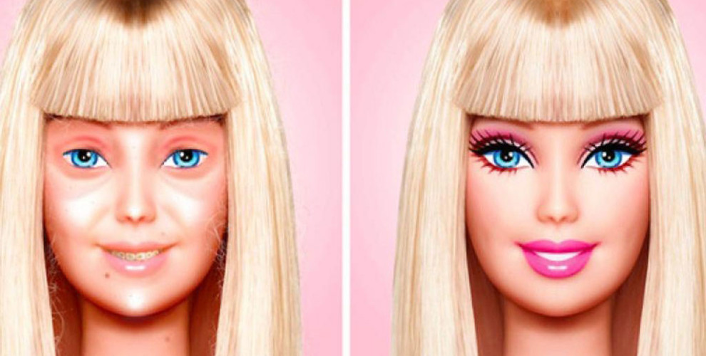
Barbie without make-up
Eddi Aguirre uses Photoshop to imagine what Barbie looks like without make-up. While the images are meant to be funny what doe they really say about this children’s toy? Should dolls have to wear make-up and what is this teaching girls?
SVA Portfolio Shows
Check out the competition at the School of Visual Arts. They have thesis shows and events planned all month.
Calling 1993
http://recalling1993.com/